Create a Web Page 101
Making Web Pages Intro
What is a Web Page?
Why Make a Web Page?
The History of HTML
Learn HTML or XHTML?
Basic HTML
Basic HTML Tutorials
Basic HTML Necessities
How to Make a Web Page
How to Edit a Web Page
The Basics of HTML Tags
Basic HTML Page Structure
HTML Attributes
HTML Font Codes
HTML Font Codes Intro
HTML Font Color Codes
HTML Font Size Codes
HTML Font Style Codes
HTML Bold/Italic Codes
Combining Font Codes
Formatting Text
Formatting Text Intro
Making Paragraphs
Miscellaneous Formatting
Headings & Subheadings
Creating Hyperlinks
Using Graphics
Using Graphics on the Web
Add Graphics to Your Pages
Graphics and Accessibility
How to Align Graphics
Page Color & Background
Graphics as Hyperlinks
Horizontal Rules
Creating Tables
HTML Tables Tutorials
HTML Table Fundamentals
Background & Border Color
Table Frames & Rules
Table Width and Alignment
Cells 1 -Space & Alignment
Cells 2 -Row Column Span
Cells 3 -Width & Height
Making Lists
HTML Frames
HTML Frames Tutorials
Using Frames for Layout
Advanced Frame Layouts
Putting Hyperlinks in Frames
Frame Border Width
Color, Margin and Control
Problems with Frames
SmartFrames: A Solution
SSI: An Alternative to Frames
Web Page Forms
Making Feedback Forms
A Simple Feedback Form
Installing NMS FormMail
Debugging Your Setup
My Web Host is Out to Lunch
User Input Components
Text Fields
Checkboxes & Radio Buttons
Dropdown Menus
Push Buttons
Layout and Presentation
Basic CSS
Basic CSS Tutorials
What is CSS?
Why You Should Use CSS
How to Use CSS
Inline Styles
Embedded Style Sheets
External Style Sheets
Class Selectors
ID Selectors
Combining Selectors
CSS Properties
CSS Properties Intro
Font Styles
Width, Height & Spacing
Borders
Backgrounds
Position
Float & Alignment
Hyperlinks
All About Web Hosting
Hosting Your Own Website
What is a Web Host?
Your Website's Home Page
Building a Website Offline
About Free Web Hosting
Best Free Web Hosting
Commercial Web Hosting
How to Get a Domain Name
Ecommerce Web Hosting
Web Hosting Terminology
Free Web Design Tools
Best Free Website Tools
Best Free Text Editors
Best Free Graphics Editors
Free Website Analysis Tools
Setting Up HTML Kit
HTML Kit Introduction
How to install HTML Kit
Screenshot Breakdown
Basic Configuration
Overall Appearance
Shortcuts and Startup
Editing Window
Customizing Toolbars
Using the Favorites Tab
Making a New Actions Bar
Odds and Ends
Free Templates
Free Website Templates
Two Column Fixed Width
Three Column Liquid Layout
Miscellaneous Templates
Dynamic Menu Effects
Two Column Experimental
Terms of Use
About These Templates
Website Templates Help
Getting Started
Template Zip File Download
How to Edit Your Template
What to Edit in the HTML
How to Add Your Logo
Making a Website
Web Design Tips
Web Design Basics
Tables vs. Tableless
Using Tables for Layout
Example Table Layouts
World's Crappiest Web Page
Twitter Backgrounds
Twitter Backgrounds Intro
Cool Twitter Backgrounds
Cool Twitter Backgrounds 2
Plain Twitter Backgrounds
Dark Twitter Backgrounds
Best Twitter Backgrounds
Cute Twitter Backgrounds
Music Twitter Backgrounds
Music Twitter Backgrounds 2
Twitter Backgrounds 101
TERMS OF USE
All About Web Browsers
What is a Web Browser?
Mozilla Firefox
Internet Explorer
Opera
How to Set Up Firefox
Top 5 Firefox Extensions
Contact
Two-Column Fixed Width Templates
Much thanks goes to my cousin Melissa for allowing me to use some of her fabulous photography in the headers and backgrounds for templates #2, #3, #5 and #6 (although the original photo for the header background in template #6 was photoshopped to smithereens to get it to look like that).
I've been making strictly tableless designs for my own sites for several years now but have been hesitant to make them available as free templates. This is largely because modifying tableless designs can lead to some complex issues like float dropping and stuff like that which is typically way over the heads of those looking for free templates. And if you don't know what I'm talking about then please see Tables vs. Tableless Design.
Okay, that's it. :o)
On with the show...
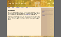
Spungold SpecialTable based ~ 2 column ~ Fixed width
Header photo © 2008 Robert Darrell
Download |
 |
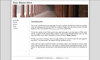
Columns - Plain White with HeaderTable based - 2 column - Fixed width
Header photo © 2008
Download |
 |
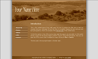
Indian LandscapeTable based - 2 column - Fixed width
Background photo © 2008
Download |
 |
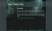
Toronto Skyscape GreenTable based ~ 2 column ~ Fixed width
Background photo © 2008 Robert Darrell
Download |
 |
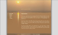
Indian SeacapeTable based ~ 2 column ~ Fixed width
Background photo © 2008
Download |
 |
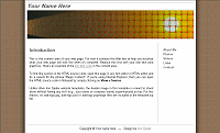
Sunset WeaveTable based ~ 2 column ~ Fixed width
Header photo Illustration
© 2008 & Robert Darrell Download |
 |
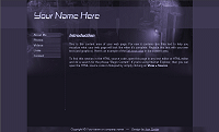
Toronto Skyscape PurpleTable based ~ 2 column ~ Fixed width
Background photo © 2008 Robert Darrell
Download |
 |
Web Hosting 101
Learn about web hosting without the technobabble!
What is Web Hosting?
Best Free Web Hosting
Affordable Domain Names
Affordable Web Hosting
See also:
How to Make a Web Page
Free Website Templates
If you need a .COM web address, you can get one quick and easy at...
| INTRO | TOP | NEXT ~> |